Common knowledge in today’s business world is that you have to use mobile-first design for your emails.
But like most “best practices,” it’s not universal. I’m about to share with you why, with best practices, your mileage may vary, and you should make testing your top priority.
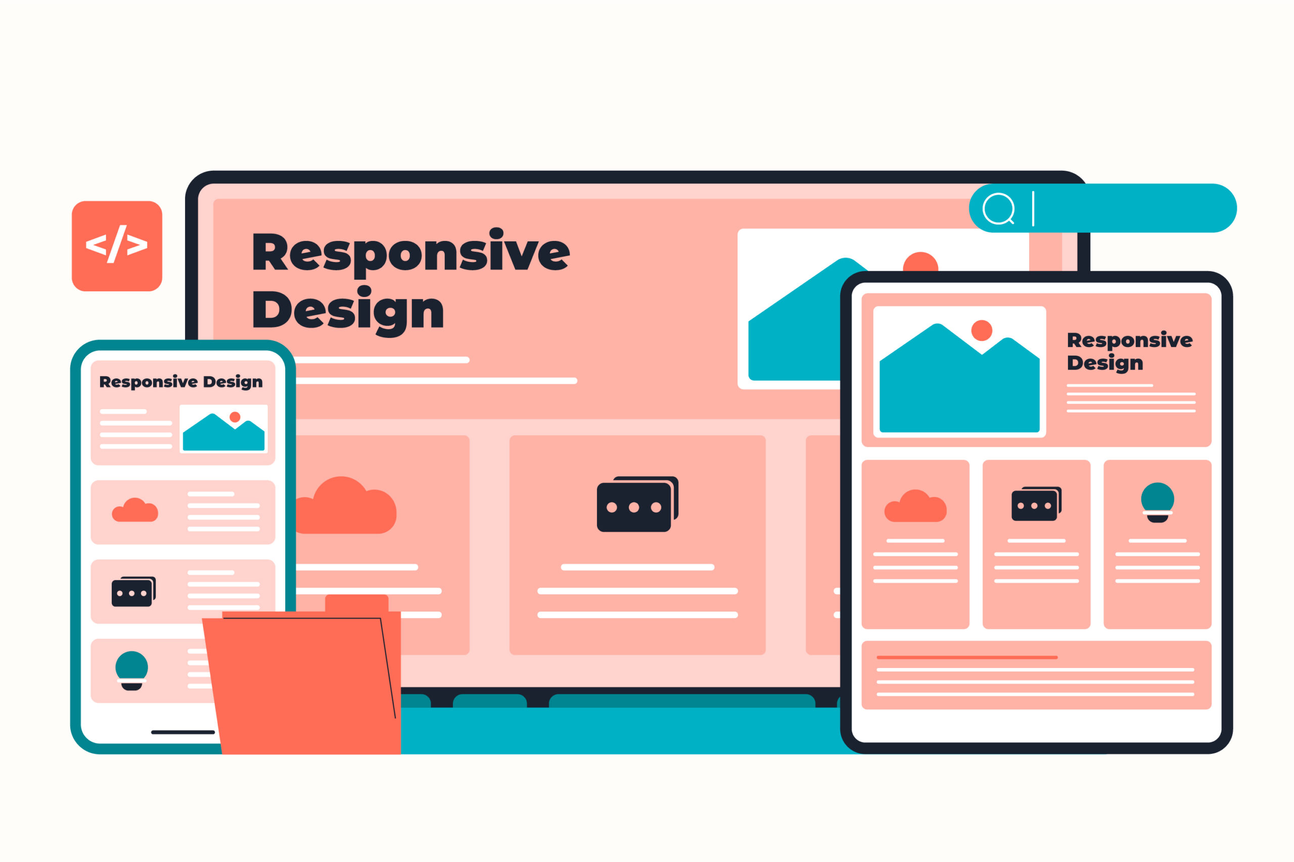
Key Takeaways
- Mobile-first design isn’t always the best choice; test different layouts for your audience.
- In an email campaign test, a responsive two-column layout outperformed a mobile-first design by 128%.
- The responsive layout suited the audience’s 80% desktop dominance, providing more visible content.
- Understand your audience’s device usage; test layouts that show more content above the fold for better engagement.
- If desktop engagement exceeds 40%, consider trying a responsive two-column layout for content-heavy emails.
The Test
I was building an email reengagement campaign for users who hadn’t opened or clicked all month. Same content, new packaging: a “monthly catalog” of the newsletter articles our customers missed during the past month.
To save time, I used Braze’s Connected Content feature to automatically pull articles from the company blog. That freed me up to test something I’d always wondered about:
Would a mobile-first layout actually outperform a responsive desktop-optimized design for this audience?
So, two variants:
- Variant A: Single-column mobile-first design—looked identical on every device.
- Variant B: Responsive two-column layout on desktop, stacking to one column on mobile.
The Results
- Variant B (responsive design) delivered a 128% higher click rate with 100% statistical confidence.
Why? Because this brand’s audience was 80% desktop-dominant.
For them, the two-column layout meant more articles visible above the fold—more immediate choices, more clicks.
The “mobile-first” version looked clean everywhere, but it underserved the people who actually clicked.
Why It Works
- Audiences behave differently than assumptions suggest; device mix tells the real story.
- Layouts that surface more content above the fold tend to earn more clicks.
- Responsive design supports every device, rather than favoring one.
Try This Week
Check the device breakdown of your audience. If desktop engagement is strong (let’s say more than 40%), test a responsive two-column layout on content-heavy emails like roundups, catalogs, or newsletters.
Track clicks and see if giving readers more to see upfront drives more to explore.
Quick, testable wins for better conversion and retention. That’s low-hanging fruit.
Leave a Reply