Blog: Low-Hanging Fruit

Quick, testable wins for better conversion and retention.

  • When “Mobile First” Isn’t the Best Choice

    When “Mobile First” Isn’t the Best Choice

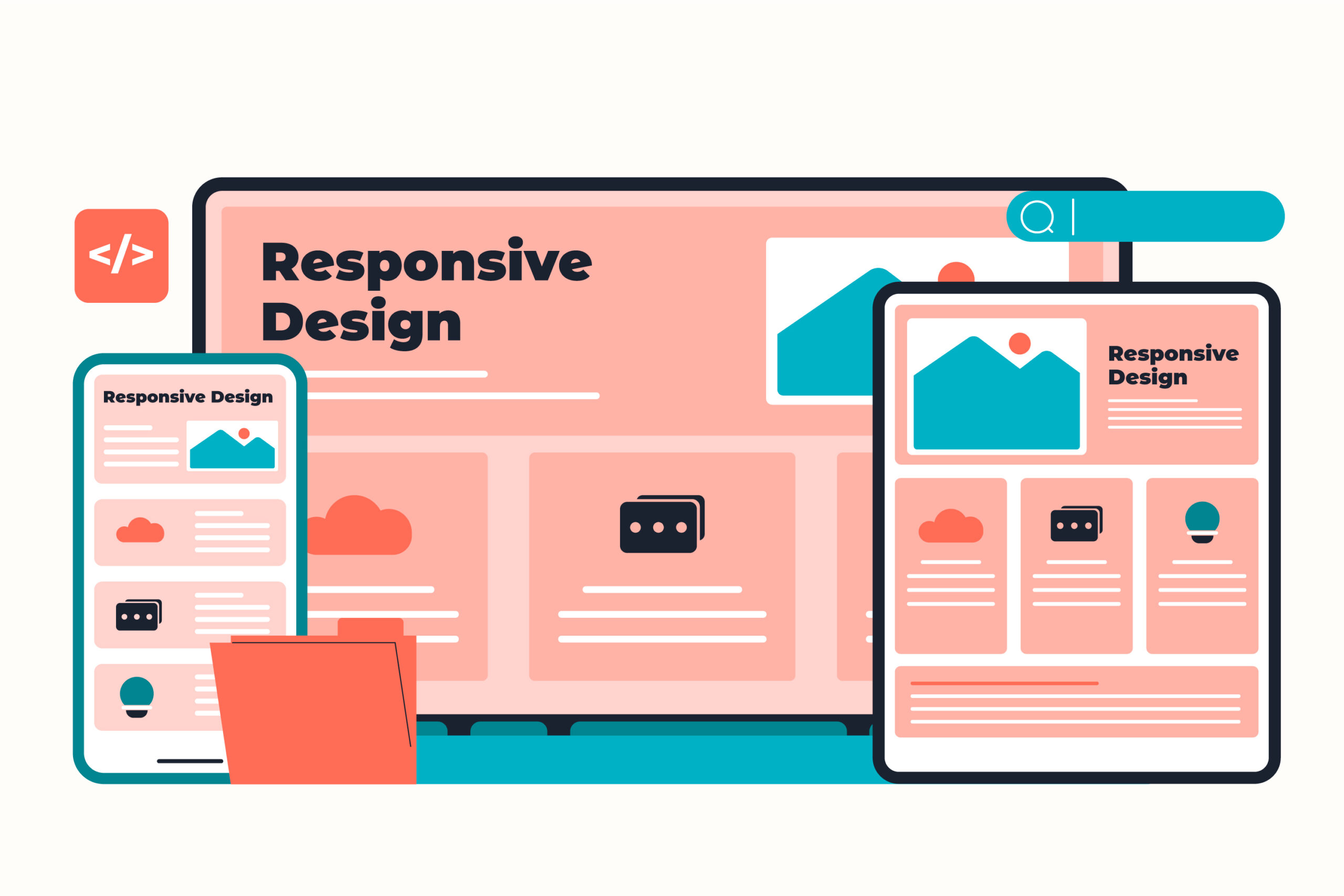
    Image designed by Freepik.

    Common knowledge in today’s business world is that you have to use mobile-first design for your emails.

    But like most “best practices,” it’s not universal. I’m about to share with you why, with best practices, your mileage may vary, and you should make testing your top priority.


    Key Takeaways

    • Mobile-first design isn’t always the best choice; test different layouts for your audience.
    • In an email campaign test, a responsive two-column layout outperformed a mobile-first design by 128%.
    • The responsive layout suited the audience’s 80% desktop dominance, providing more visible content.
    • Understand your audience’s device usage; test layouts that show more content above the fold for better engagement.
    • If desktop engagement exceeds 40%, consider trying a responsive two-column layout for content-heavy emails.

    The Test

    I was building an email reengagement campaign for users who hadn’t opened or clicked all month. Same content, new packaging: a “monthly catalog” of the newsletter articles our customers missed during the past month.

    To save time, I used Braze’s Connected Content feature to automatically pull articles from the company blog. That freed me up to test something I’d always wondered about:

    Would a mobile-first layout actually outperform a responsive desktop-optimized design for this audience?

    So, two variants:

    • Variant A: Single-column mobile-first design—looked identical on every device.
    • Variant B: Responsive two-column layout on desktop, stacking to one column on mobile.

    The Results

    • Variant B (responsive design) delivered a 128% higher click rate with 100% statistical confidence.

    Why? Because this brand’s audience was 80% desktop-dominant.

    For them, the two-column layout meant more articles visible above the fold—more immediate choices, more clicks.

    The “mobile-first” version looked clean everywhere, but it underserved the people who actually clicked.


    Why It Works

    1. Audiences behave differently than assumptions suggest; device mix tells the real story.
    2. Layouts that surface more content above the fold tend to earn more clicks.
    3. Responsive design supports every device, rather than favoring one.

    Try This Week

    Check the device breakdown of your audience. If desktop engagement is strong (let’s say more than 40%), test a responsive two-column layout on content-heavy emails like roundups, catalogs, or newsletters.

    Track clicks and see if giving readers more to see upfront drives more to explore.


    Quick, testable wins for better conversion and retention. That’s low-hanging fruit.
  • The Power of a From Address

    The Power of a From Address

    Image designed by Freepik.

    or “How Optimizing Your Friendly From Address Can Work for You.”

    If you’ve ever managed marketing emails, you know the debate:

    Do you send from “marketing@brand.com” or try something different? Something more human?


    Key Takeaways

    • A friendly from name or address is a small, easy-to-test part of email optimization that can have an outsized effect on engagement.
    • Using a recognizable person as the sender can remind recipients why they signed up and make the message easier to recognize in a crowded inbox.
    • In a webinar email test, using the presenter as the sender increased open rates 9.8% and click-through rates 59.3%.
    • A distinctive from address can have benefits beyond immediate engagement. In an earlier experiment, descriptive addresses also made emails easier to find later through inbox search.
    • Test sender-name changes over multiple sends rather than assuming a more personal sender will perform better for every audience.

    When I worked at an agency, I got bored with the default email address of “marketing@blahblah.com.” There was nothing wrong with it, but it lacked a certain something. So we started experimenting.

    We swapped the generic address for something that matched the brand personality:

    • jeans@wellknownmallstore.com
    • gifts@wellknowngiftretailer.com
    • pets@highendpetstore.com

    Clients loved it because it was cute and captured their brand in a way that “marketing@” just couldn’t do. The “friendly from” (the display name or a more human-readable text that appears in the “from” field of an email) remained the name of the retailer. Most shoppers wouldn’t even notice the difference, but it had an unintended consequence: it made messages easier to find later. Searching Gmail for “jeans” or “gifts” often surfaced our campaigns first, even when there were emails from their competitors in the same inbox. This was a small detail, but an unexpected win.


    Testing It Again. This Time for Webinars

    At my current company, webinars are a major engagement channel. We wondered: could a similar principle apply to event reminders?

    So we tested it.
    Instead of sending reminders and follow-ups from a faceless address, we used the presenter’s name as the “friendly from” and their first name in the “from” address, so the email was <Sarah> sarah@companyname.com.“

    Result:

    • +9.8% increase in open rate (100% confidence)
    • +59.3% increase in click-through rate (99% confidence)

    People respond to people. When the “From” line shows a real host, it triggers recognition and trust.


    Why It Works

    1. Human signal: A named sender cuts through inbox noise.
    2. Context memory: Recipients recall previous webinars with the same person and are also more likely to remember signing up when they see that name again.

    Try This Week

    Pick one upcoming webinar or campaign and test a new Friendly From:

    • Use a presenter or recognizable figure (even “Sarah at Brand Name” works).
    • If your email system won’t allow you to change the entire from address, try just changing the friendly from. We’re testing, so just give it a try.
    • Keep tone consistent with the brand voice. But feel free to use first person.
    • Track opens and clicks over at least two sends.

    The from name isn’t the only seemingly minor email decision worth testing. I’ve seen the same thing happen with email layout and visual hierarchy.


    Quick, testable wins for better conversion and retention. That’s low-hanging fruit.